Foundations
Logo & Symbol
The BioInnovation Greece mark pairs the “big” symbol with the wordmark. It comes in three color treatments only: primary blue, black or white.
Primary lockup

On light · Primary blue (default)

On Polynesian Blue · White
On dark and imagery · White
One-color print · Black
The symbol
The symbol carries the brand where space is tight: favicons, social avatars, app icons and badges. It is cut out of the circle, so the background shows through the letters. Always use the filled symbol. The open, outlined version of the symbol is reserved for the Forum and is never used elsewhere.
Blue · on light
Blue · on Mist

White · on Polynesian Blue
White · on black
Black · one-color print
Clear space & minimum size
Keep other graphics, text and edges away from the mark. As a working rule, leave clear space equal to half the height of the symbol on every side.
What never to do
The mark is fixed artwork. Use the supplied files, not a redrawn copy.
Don’t stretch or squash it.
Don’t recolor it. Blue, black or white only.
Don’t add shadows, glows or outlines.
Don’t place the blue mark on busy or low-contrast backgrounds. Reverse it to white.
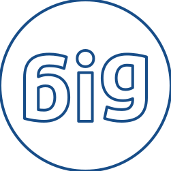
Don’t use the open, outlined symbol. It is reserved for the Forum. Everywhere else, use the filled symbol.

Never combine the outlined symbol with the BioInnovation Greece text. The only exception is the official Forum logos.
The handbook does not cover co-branding. The rules below are recommended defaults and should be confirmed before large print runs.
Principles
- Equal footing. Size the logos so they look the same height optically. A partner logo is never smaller than the BiG logo unless the partner has agreed to it.
- Clear space. Keep at least half the height of the BiG symbol between logos, and between each logo and the edge of the group.
- One treatment. On a dark or colored background, use the white version of every logo. On white, use the full-color or black versions. Do not mix.
- Unaltered logos. Never redraw, recolor, crop or add effects to a partner logo.
Layouts
Partner logoSide by side · Divided by a thin vertical rule. Order follows who hosts: the host first.
in partnership withPartner logoStacked with a label · For narrow formats. Set the label in Arial regular, 12 to 14 pt.
Partner logo(white)
On Polynesian Blue · All logos in white.
Partner band · For several partners, use one row at the bottom of the page, equal heights, on a white or one-color strip.
Programs
- BioSTART. Always carries “by BioInnovation Greece”. Partners appear in a separate band, never inside the endorsement line.
- BiG Forum. Partners and sponsors appear in the partner band, in white on the key visual.